Rivala Project overview
Understanding the User
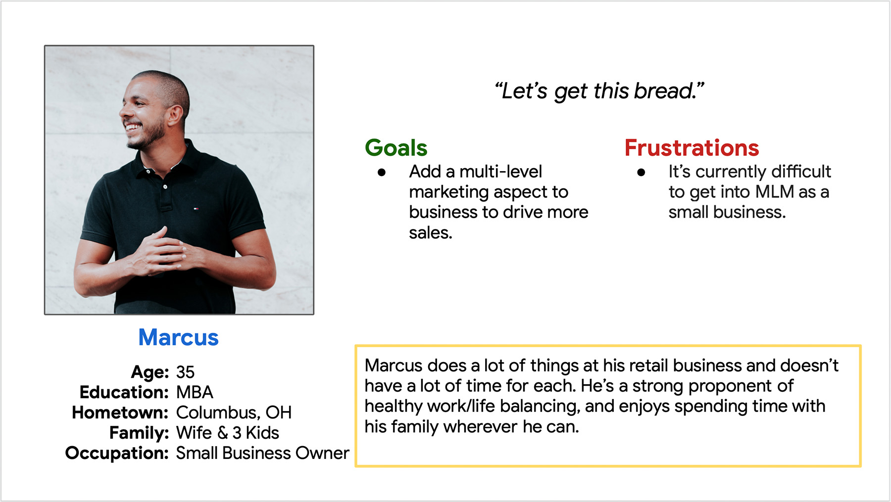
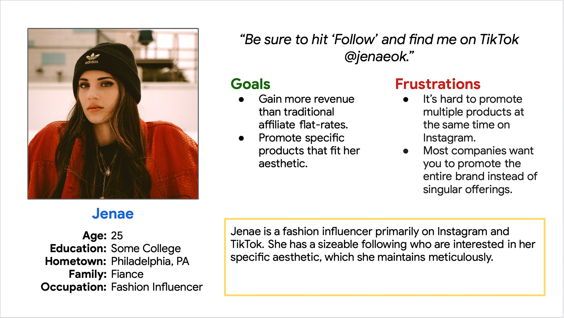
This project is unique in that there are two distinct user profiles to consider: business owners and affiliates. I created a user persona for each to use as a guiding reference.

Persona: Marcus
User Story:
As a small business owner, I want to quickly gain insights into my top promoters, so that I can manage my relationships with them.
Persona: Jenae
User Story:
As a fashion influencer, I want to quickly gain insights into my top brands & products, so that I can better focus my time.
Starting the design
I started by sketching out some paper wireframes of potential screen layouts.
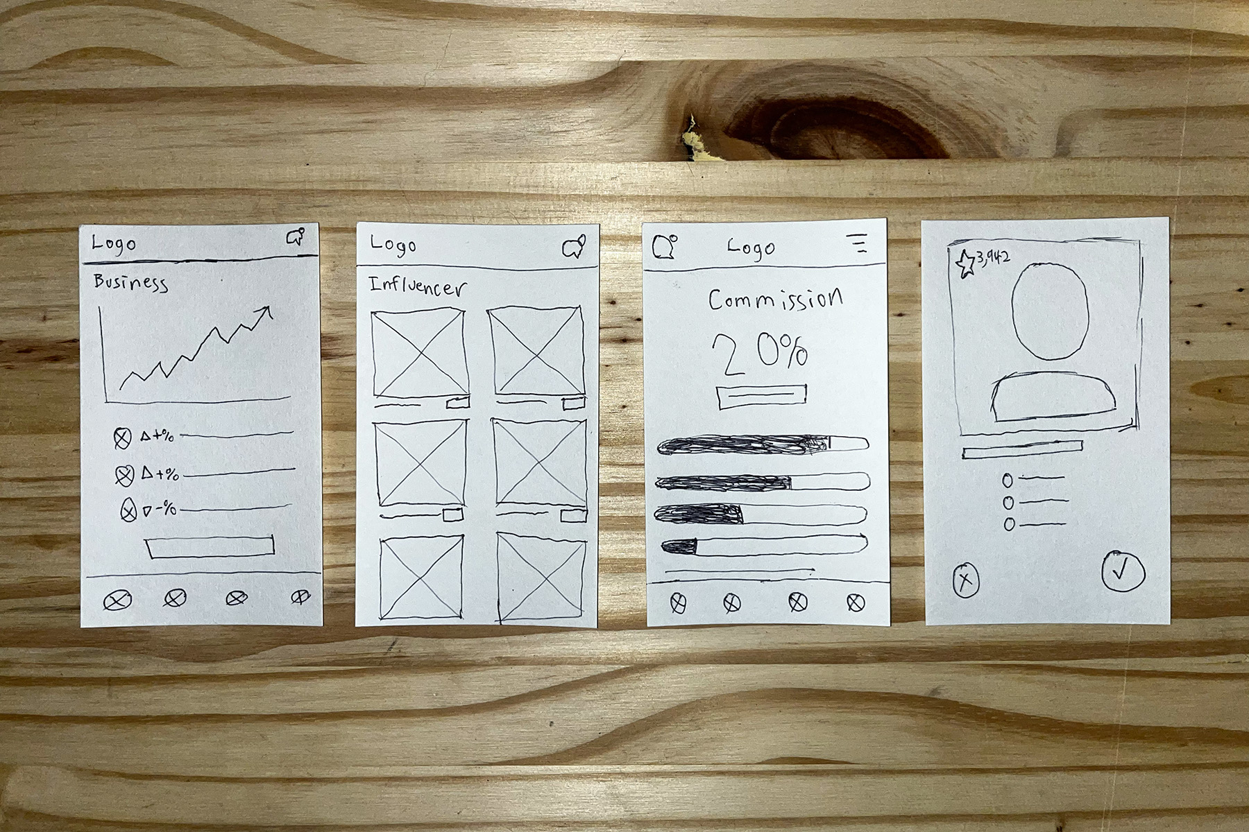
Initial Business Prototype
Initially the business view had a lot of analytics that would certainly be important, but the stakeholders and myself had not yet decided how the business user would interact with the promoters.
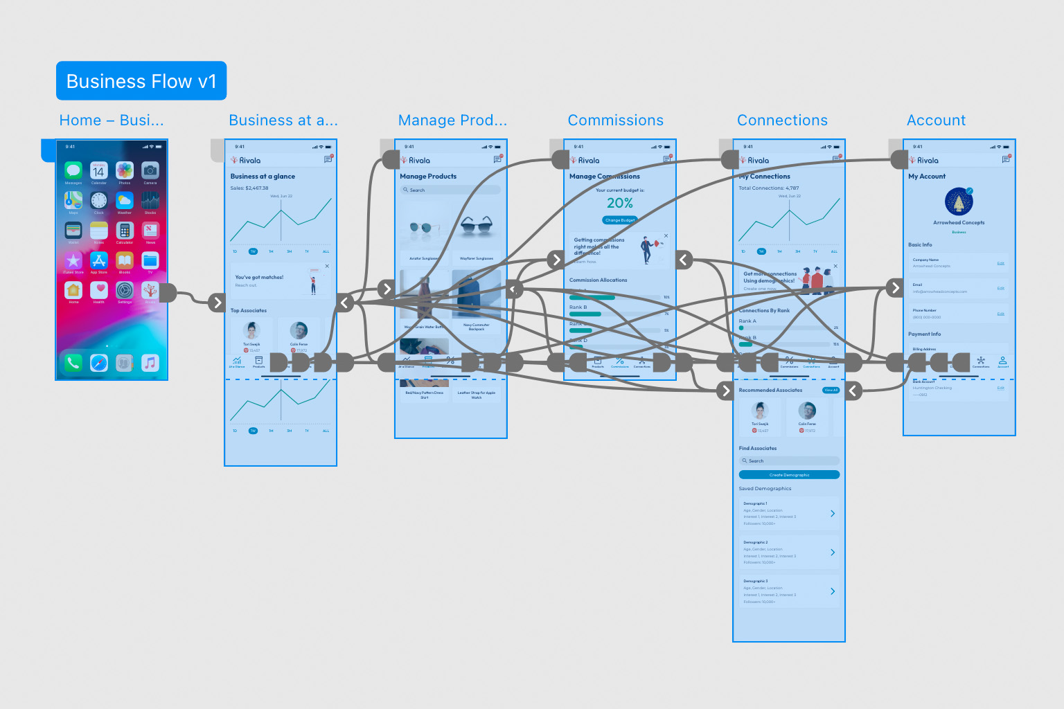
Initial Promoter Prototype
Similarly with the promoter view, we had trouble connecting how the user would interact with businesses.
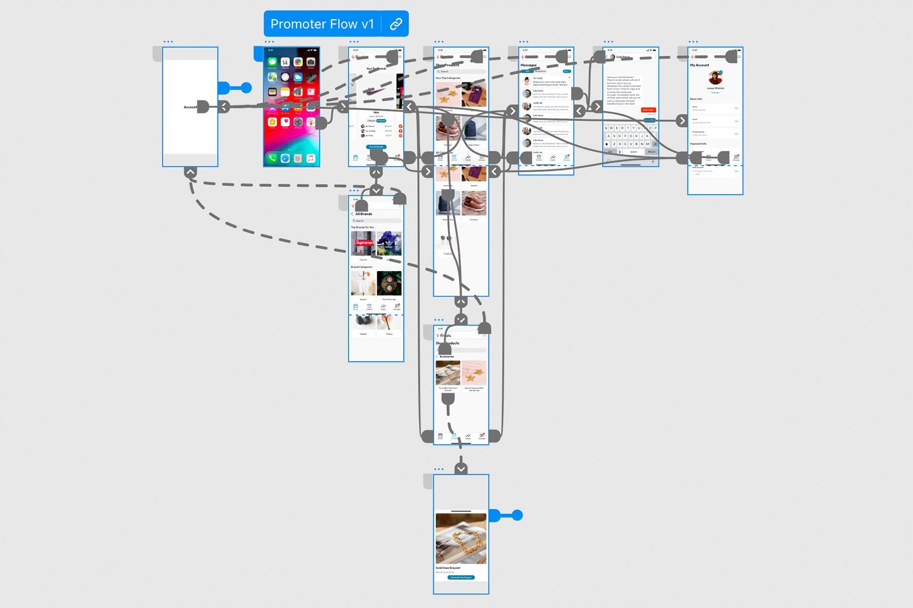
Refining the design
The prototypes went through several phases as it went back and forth between the stakeholders and myself.
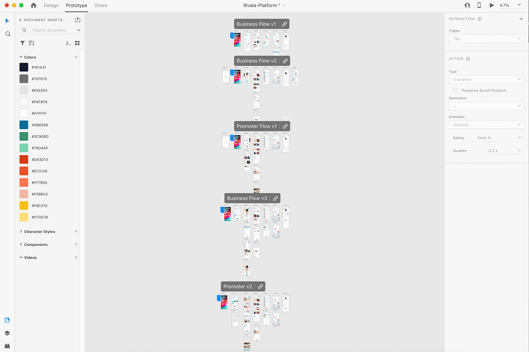
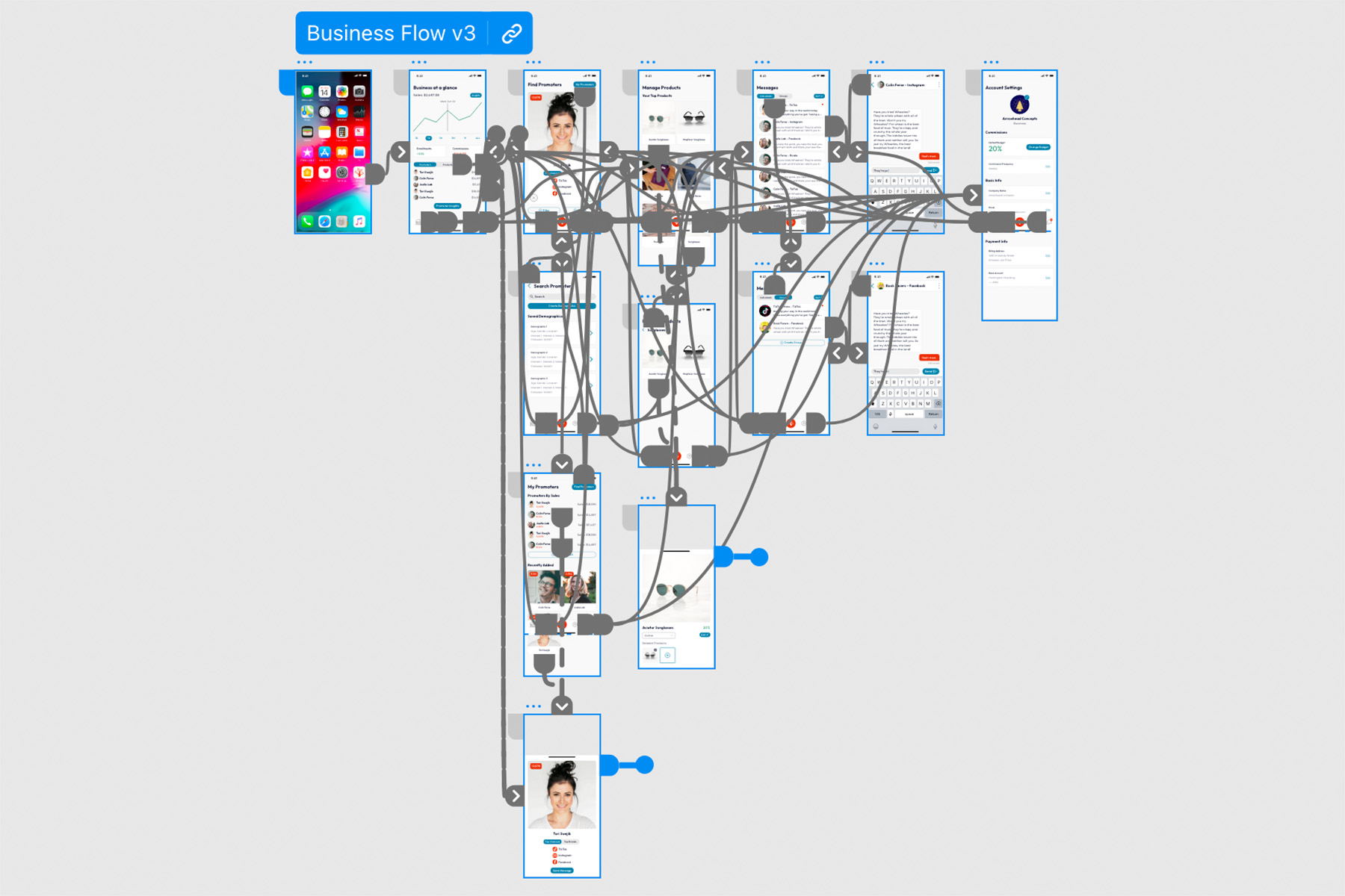
Final Business Prototype
By the third revision, we had a really solid product design. This was sent to developers to build the framework for the back-end systems.
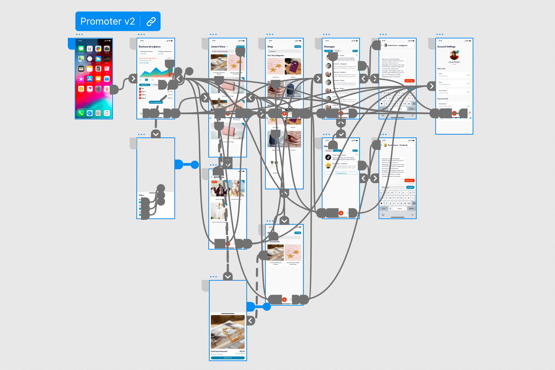
Final Promoter Prototype
The promoter prototype only took 2 revisions since we learned so much by doing the business view first.
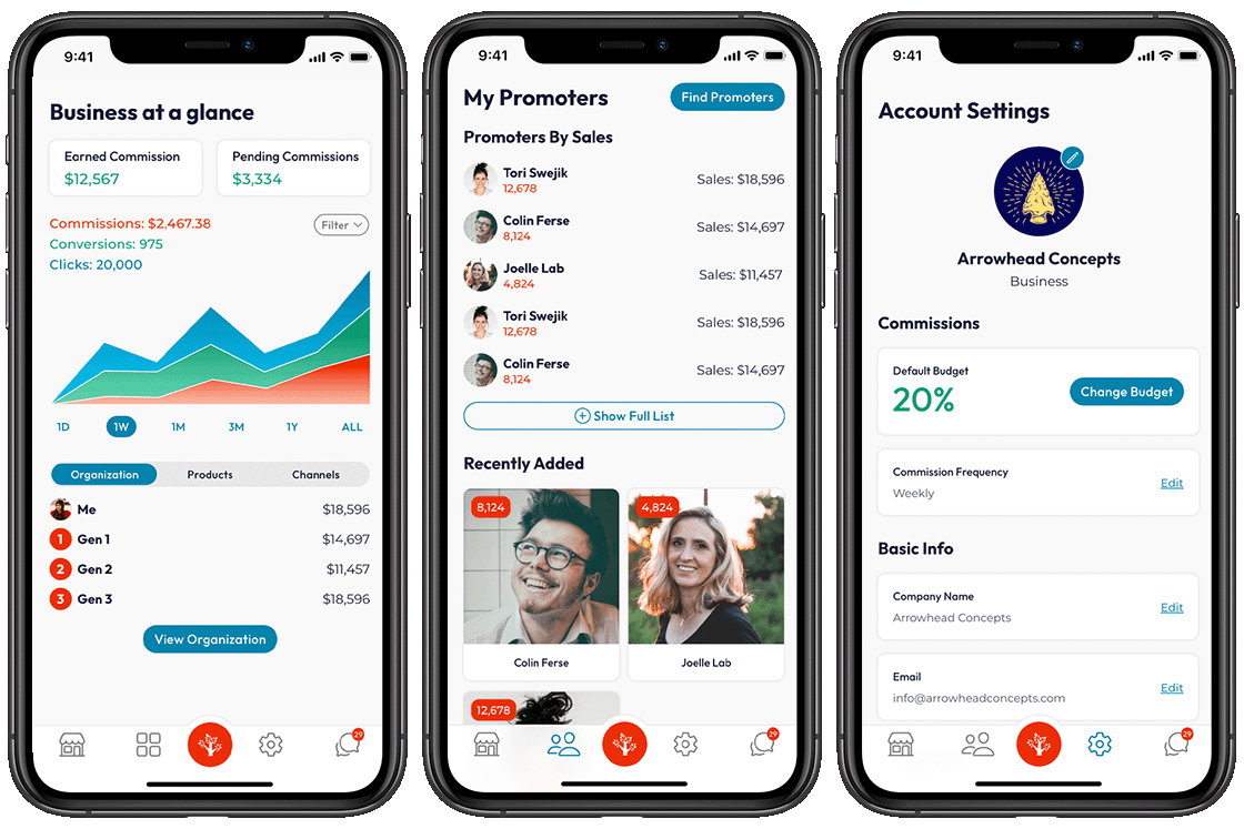
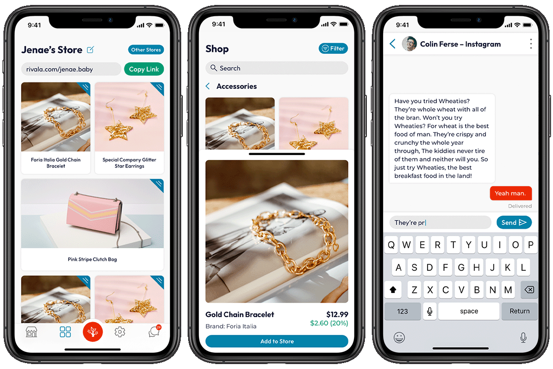
Platform Mockups
Because this is a native app, only mobile device screens were considered for the platform. Designed with a width of 375px.
Rivala Website
I was also tasked with designing the Rivala marketing website based on some messaging and branding that had been established after the app prototypes were developed. I took some basic brand guidelines and refined them into an eye-catching web page.


