Beyond Broken Project overview
Understanding the User
For user research, I conducted two moderated remote usability studies with 5 participants each. We gave the users a task to complete and monitored how they attempted to complete them. Before the first one, I had assumed that everything should go fairly smoothly, but found a few friction points that needed sanding down in order to hit that sweet spot for usability.

Pain Points
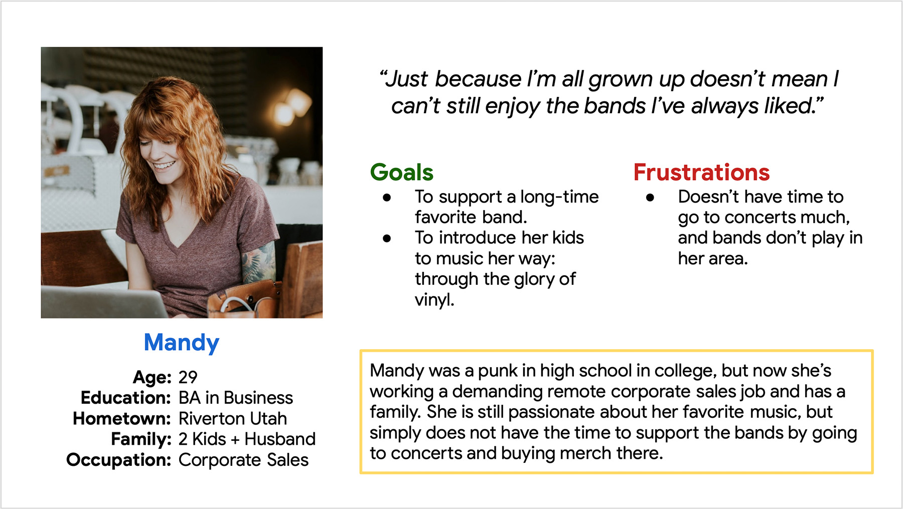
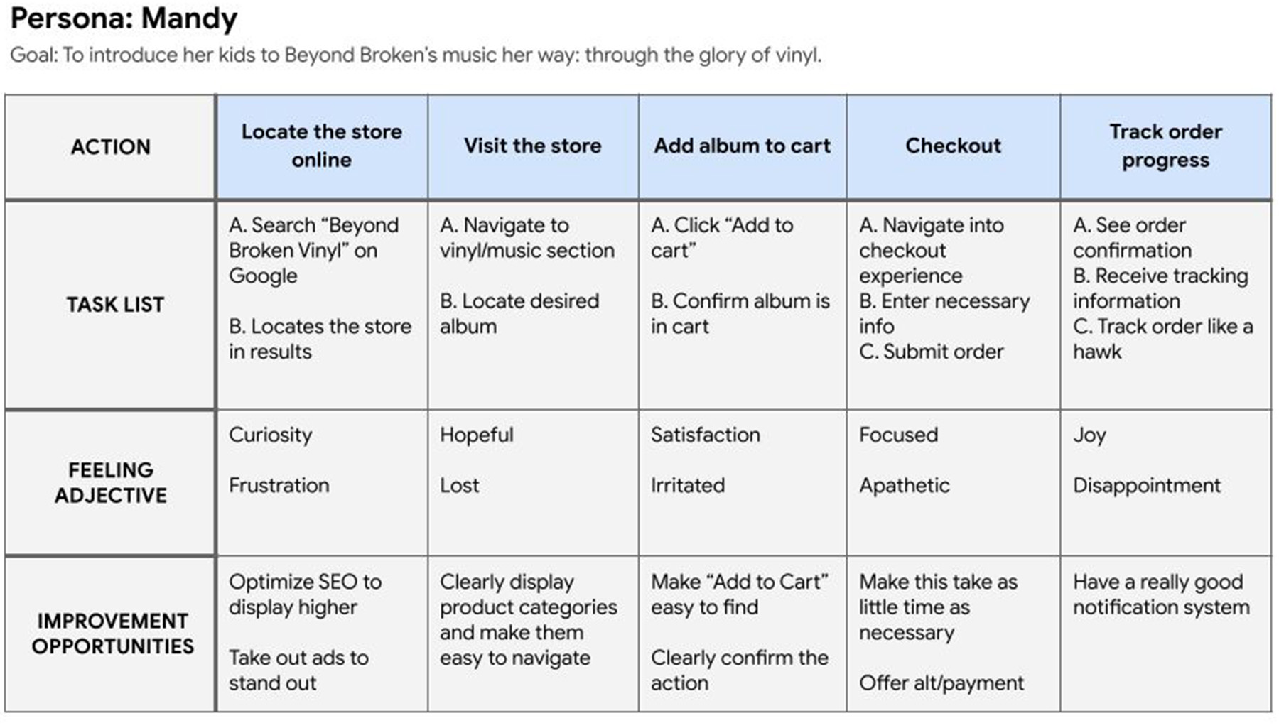
Persona: Mandy
Problem statement:
Mandy is a busy mom and corporate drone who needs to order Beyond Broken vinyl so that she can share the vinyl music experience with her kids.
User journey map
Mapping Mandy’s user journey helped me narrow down where to focus my efforts to make the app as easy to use as possible.
Starting the design
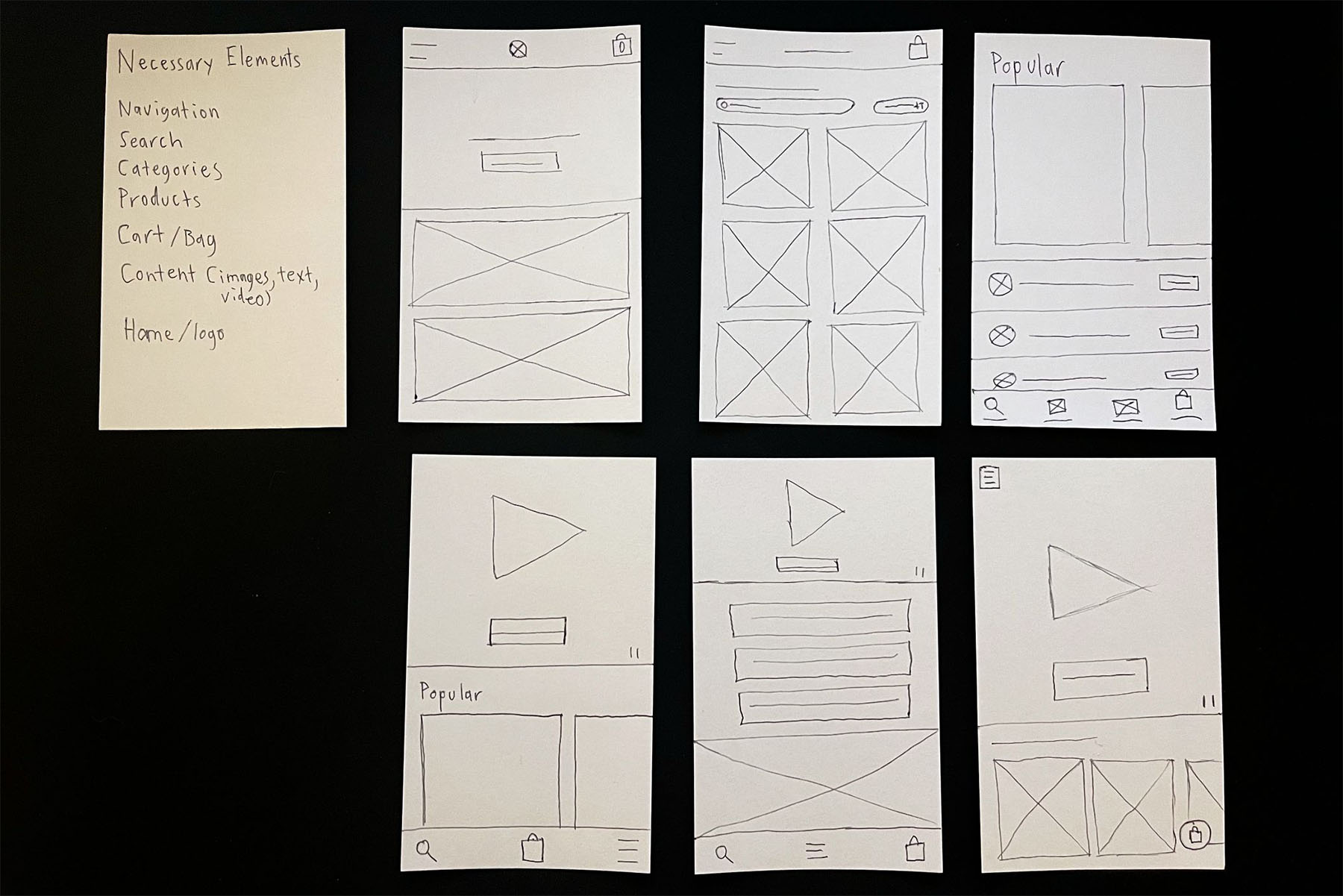
I sketched out some wireframes to get an idea of some page layouts and elements that might work. A few ideas that started here made it into the final product.
Digital wireframes
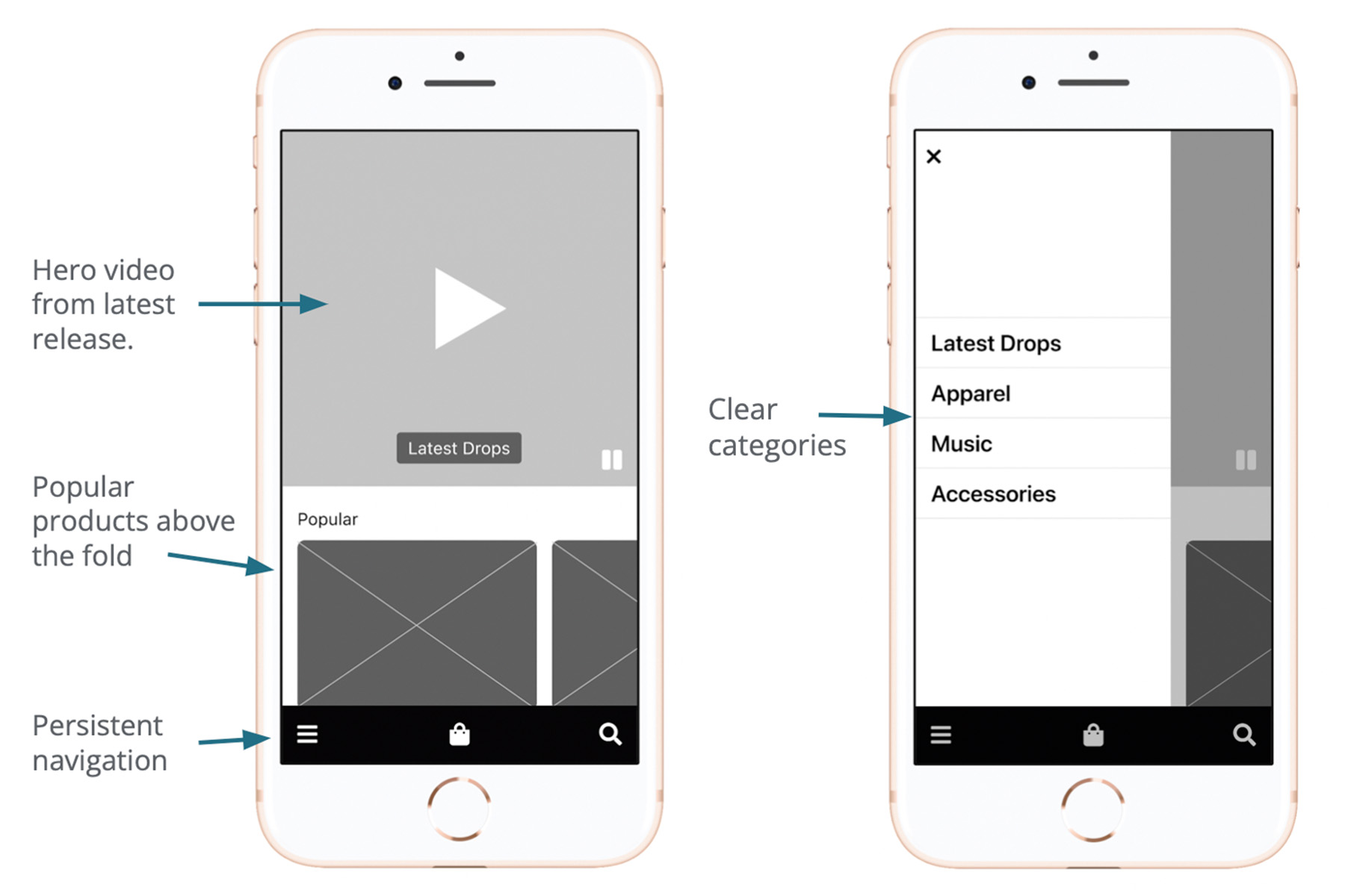
The wireframes evolved over time, and updates were made based on user feedback. One major friction point for users was that they didn’t really connect with the original “creative” category names, so we dialed them back to something more clear and broadly understood.
Low-fidelity prototype
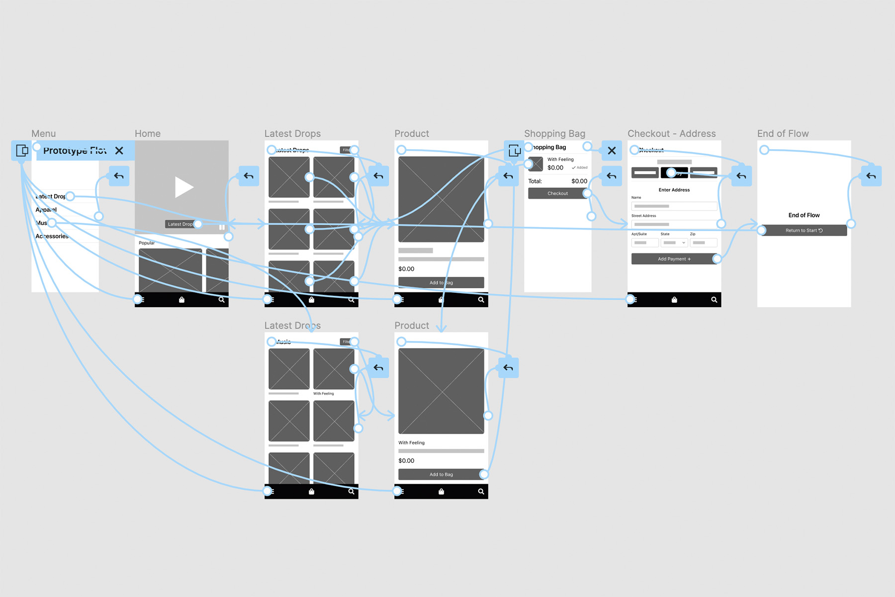
The low fidelity prototype formed the basis for the first usability study. It encompasses a basic flow through the entire shopping experience.
Usability Study
For this project, I ran two remote usability studies: one on the lo-fi prototype, and then one on the hi-fi prototype. This really helped confirm that the decisions made solved user issues, and gave insight on how to move forward in the future.

Study 1 Findings
• Users wanted a simpler checkout
• Users wanted alternate payments
• Users did not understand the categories
Study 2 Findings
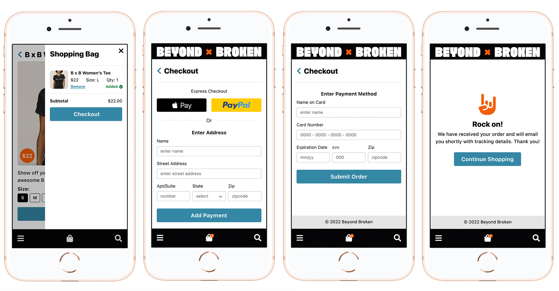
• Two-step checkout was better
• Needed different color for interactive elements
• Needed a confirmation page
Refining the design
Armed with user feedback, I set off to apply that to the design and move into the hi-fi stage.
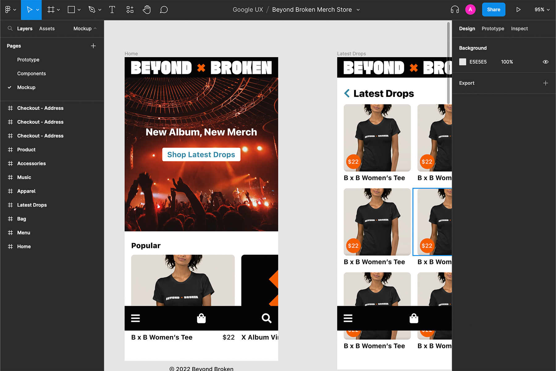
Applying User Feedback
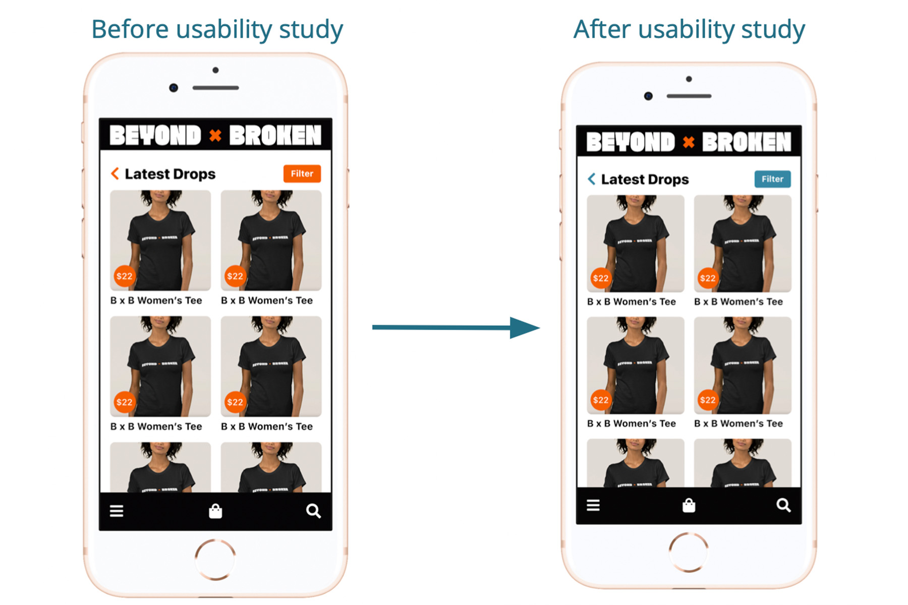
Because orange was basically the only color being used for accents and interactive elements, users were often confused as to what was interactive or not. I opted to switch the interactive controls to use a blue color instead.
Mockups
Because this is intended to be a native app, the design was built with a screen width of 375px.
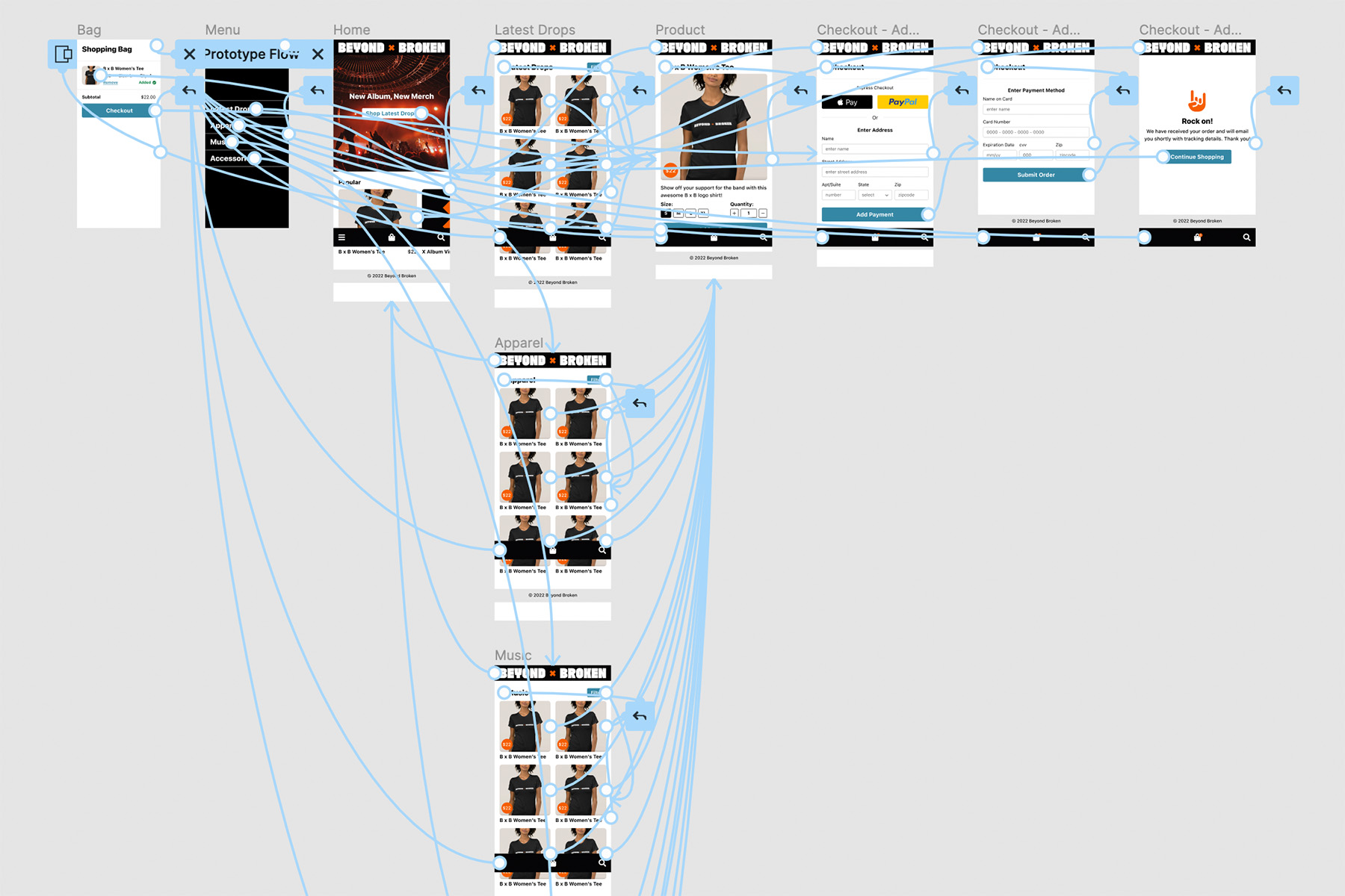
High-fidelity prototype
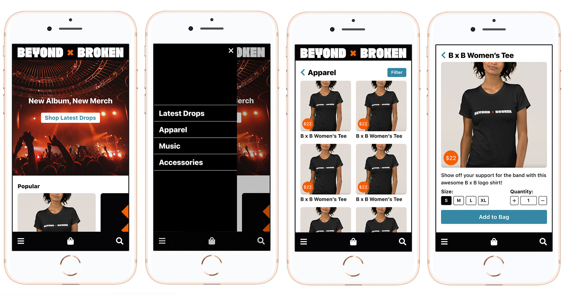
The final prototype has ironed out all the usability issues we encountered through testing.
