Dev Wise Project overview
Understanding the User
I conducted a user interview, then created an empathy map to better understand the user’s frustrations. I then created a user journey map to see where I could identify the most important areas for improvement.
Pain Points
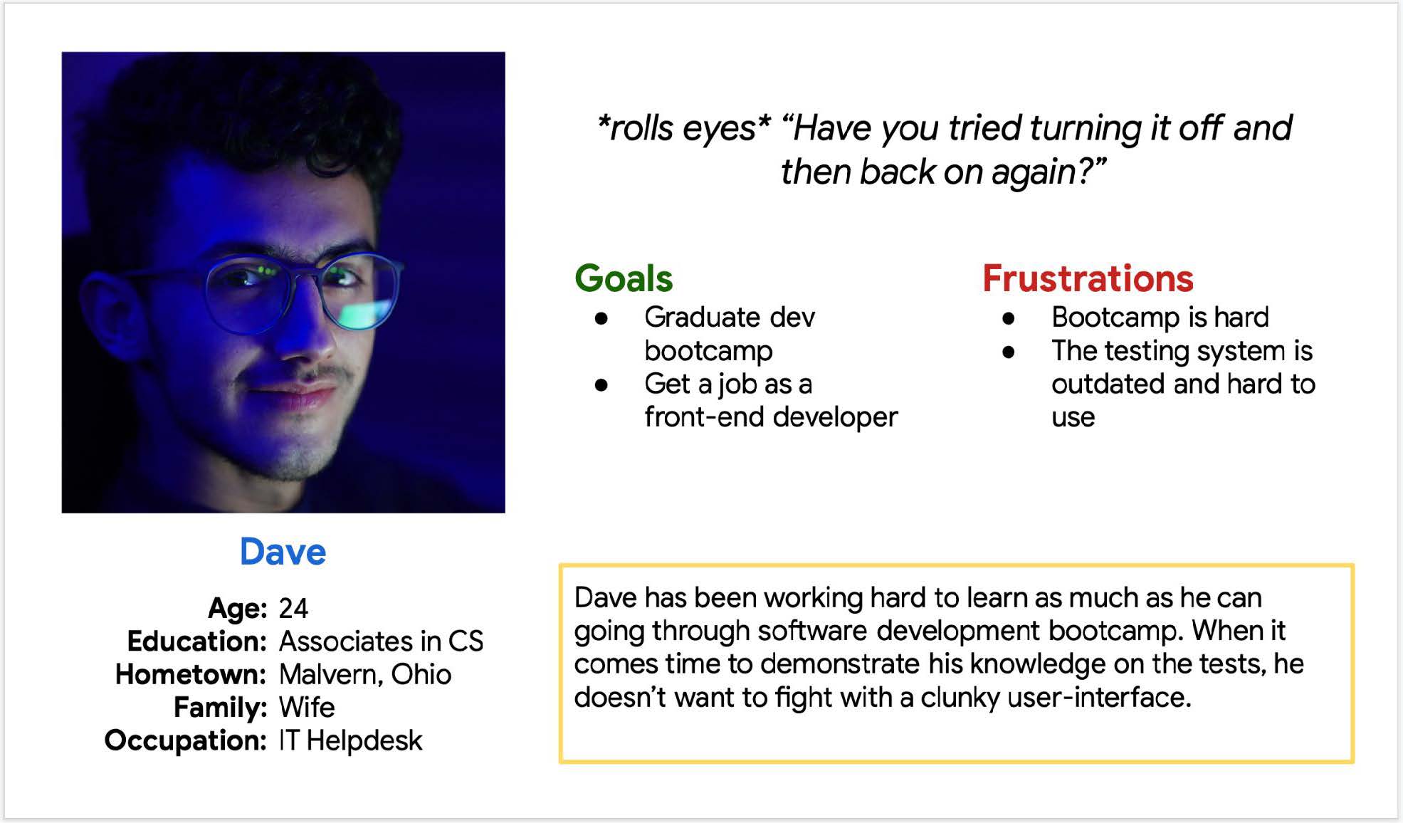
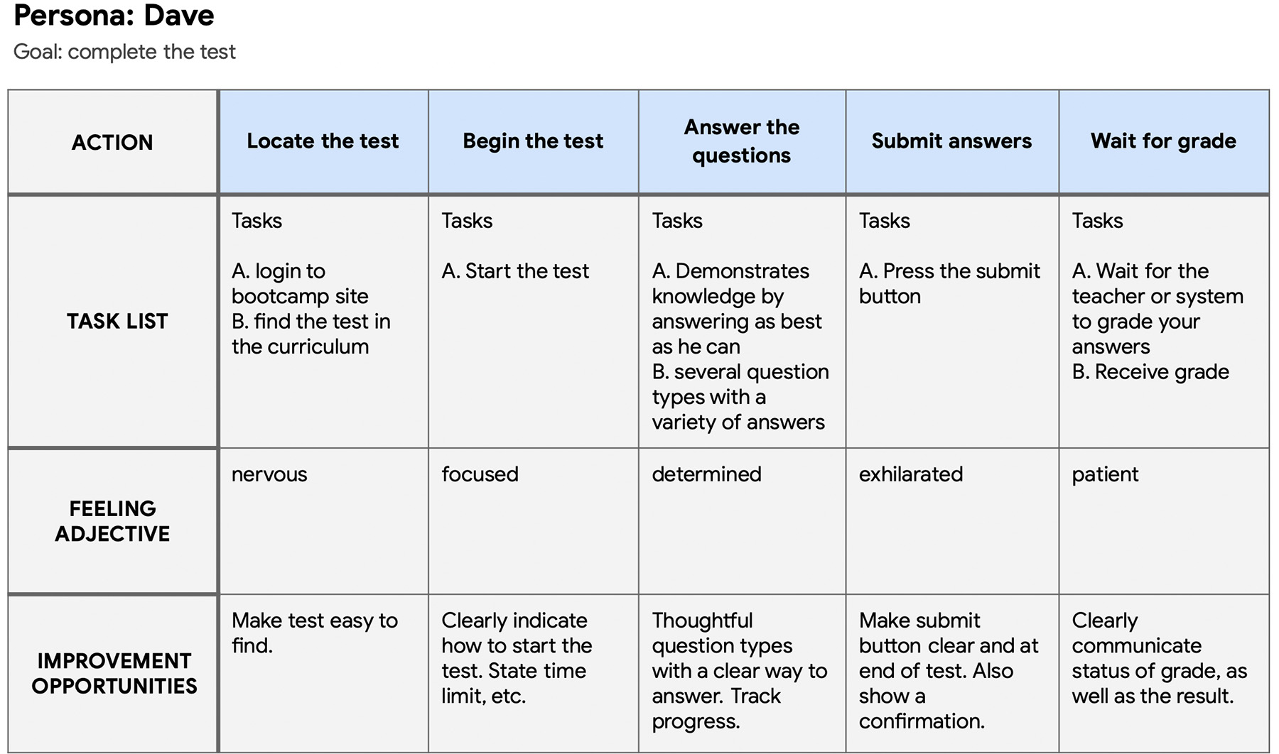
Persona: Dave
Problem statement:
Dave is a software development student who needs to take an online test without struggle because he wants to pass bootcamp.
User journey map
I created a user journey map to help identify the most important areas for improvement.
Starting the design
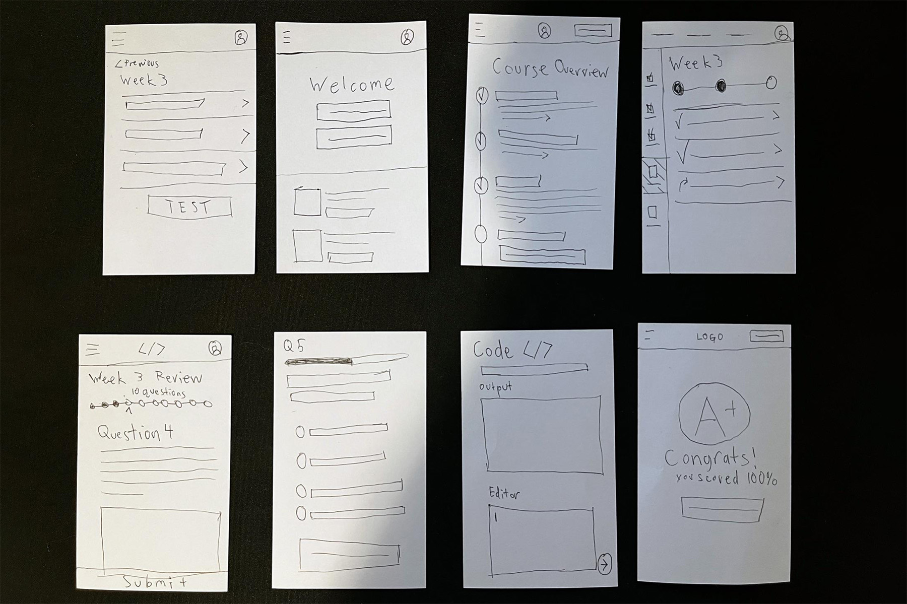
I started by laying out initial ideas using Crazy Eights
Sitemap
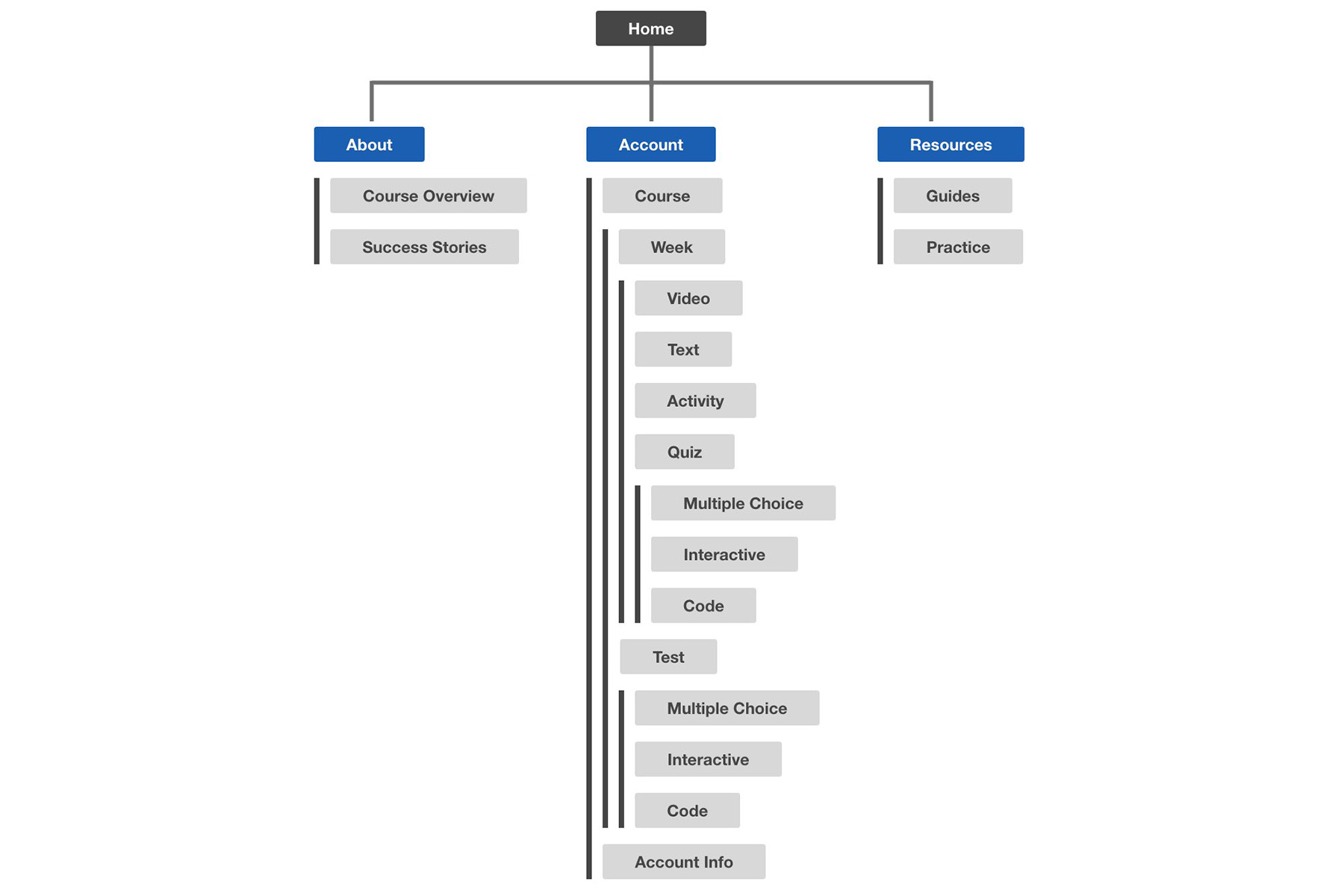
The most important aspect of the user experience was identified to be the course structure itself.
Digital wireframes
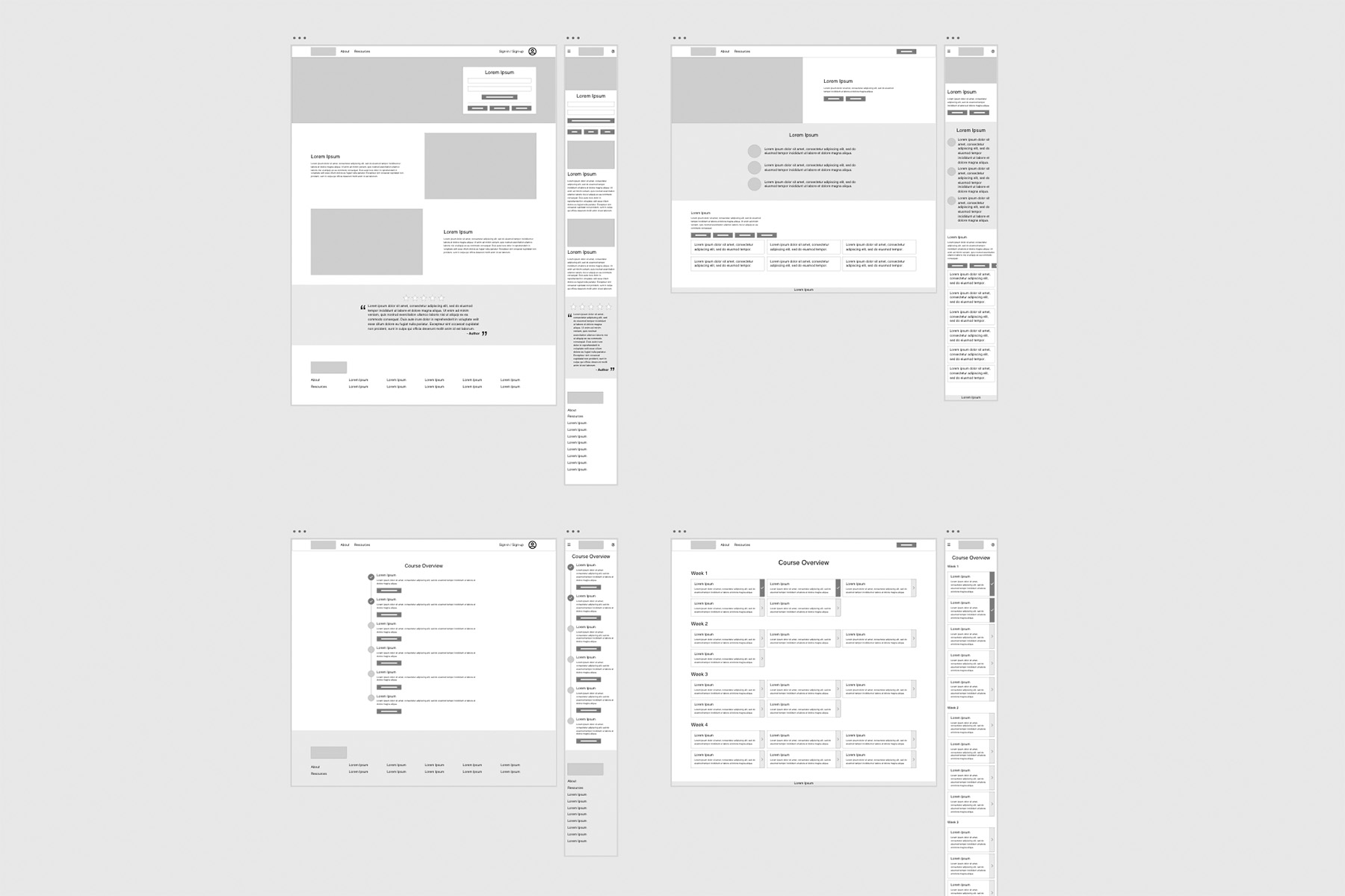
The Course Overview served as a great starting point for wireframes. All screens were mocked up in desktop and mobile versions.
Low-fidelity prototype
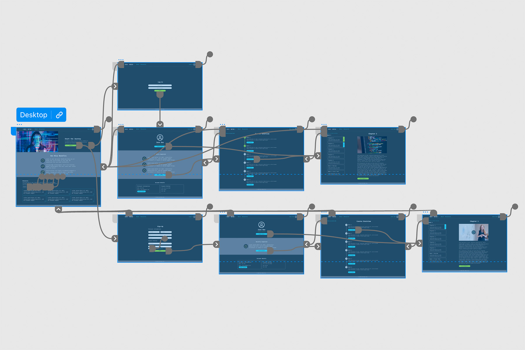
Eventually, I worked the wireframes into a functioning digital prototype.
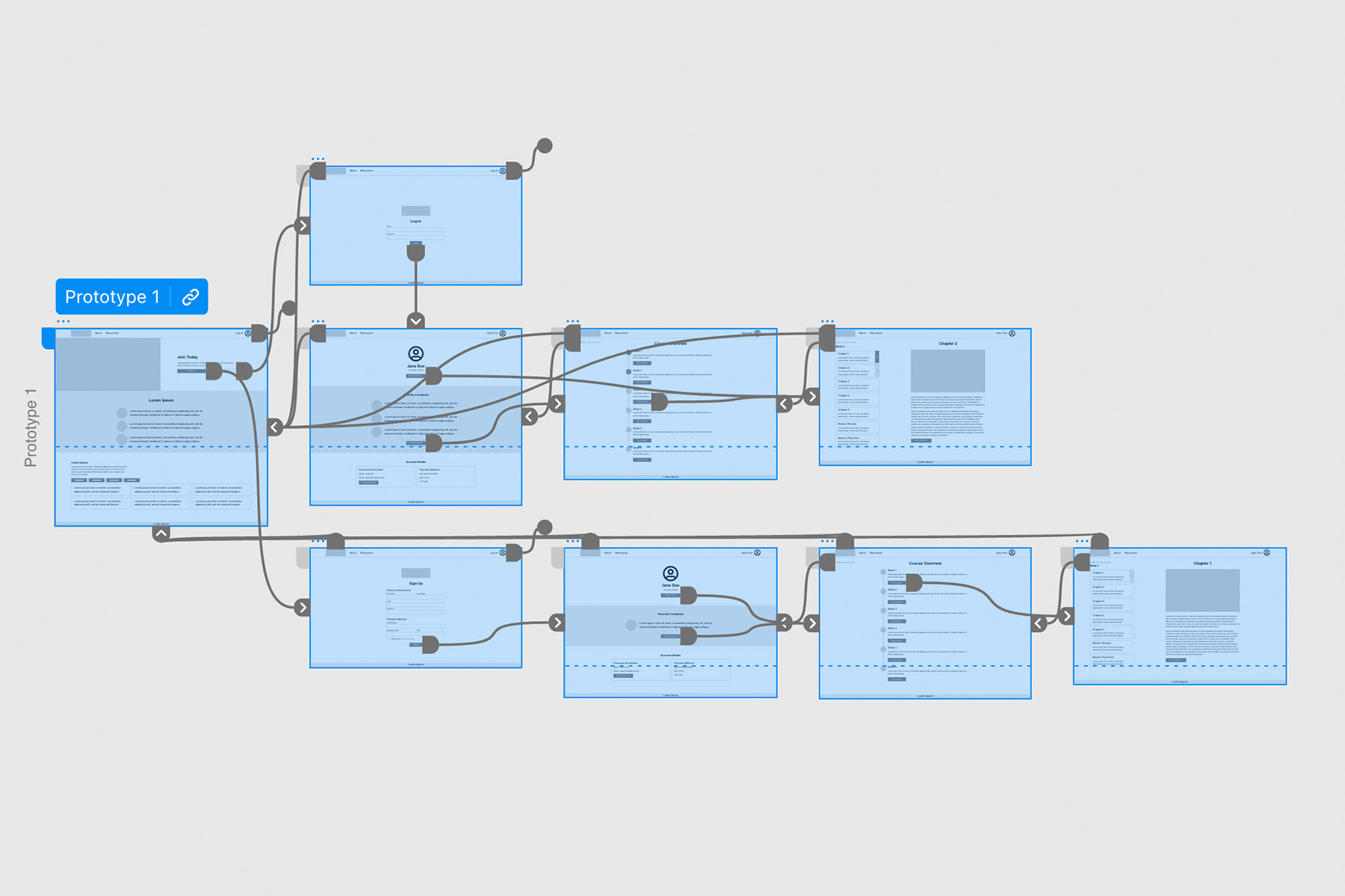
Usability Study
I then conducted a usability study on the lo-fi prototype to get an idea of how to improve the design before moving on to hi-fi.

Parameters
Findings
• Test was hard to find.
• Users wanted dark mode.
• Needs a “Resume Course” feature.
Refining the design
Armed with user feedback, I set off to apply that to the design and move into the hi-fi stage.
Mockups
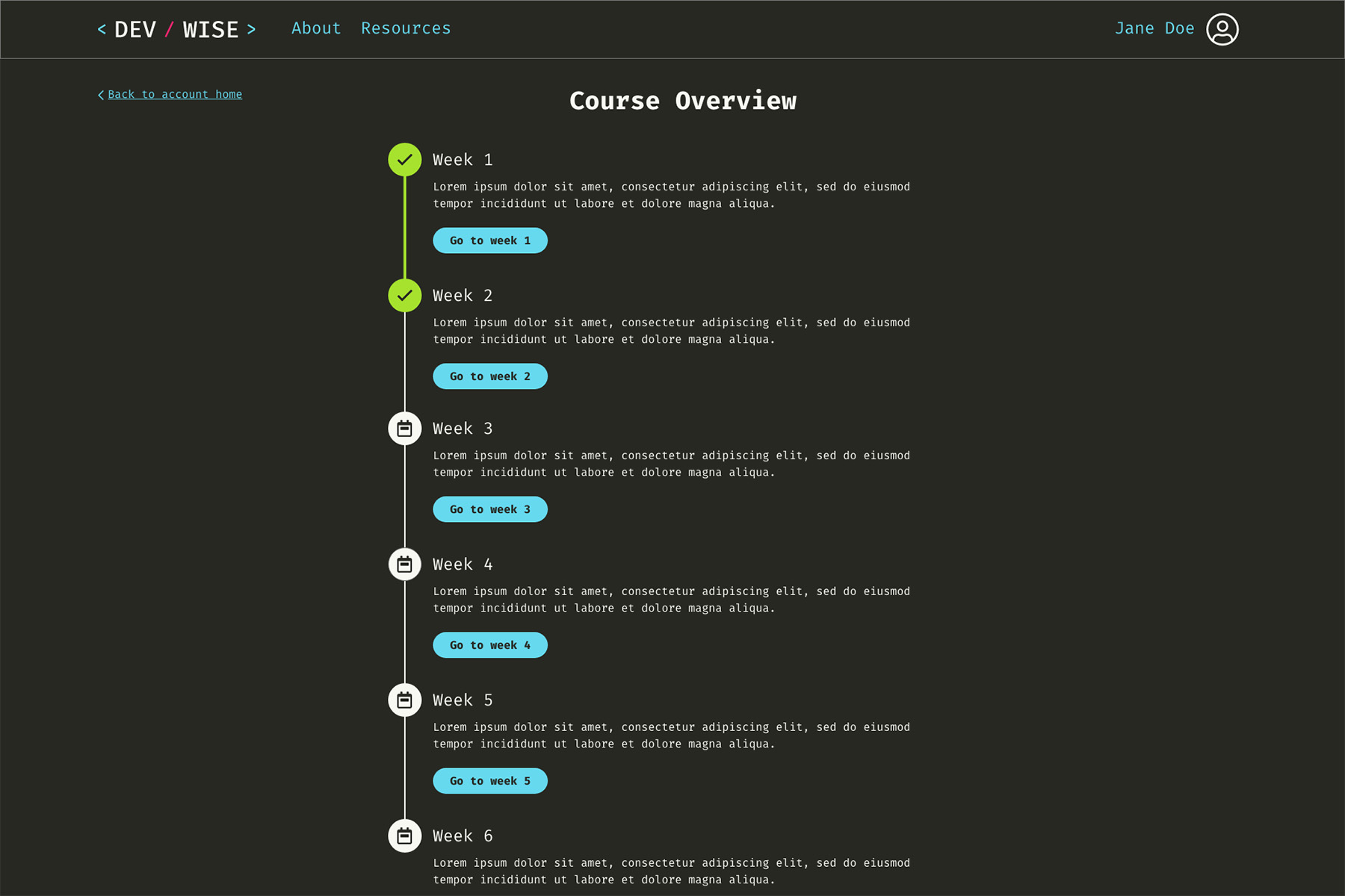
Initially, the Account screen only had a “Go to Course” button. This required users to navigate to where they’d left off manually. In the new version, we added a “Resume Course” button, and moved the “Course Overview” button lower on the page.

Users expressed the need for a dark mode color scheme. A lot of them are doing classes at night in a dark room.

Original Screen Size
Because the primary user demographic will access this site on desktop, I started the design for a screen size of 1920x1080px.
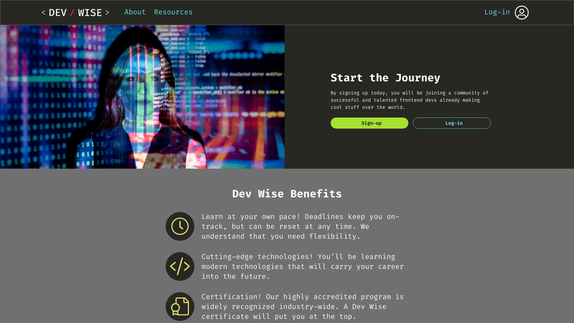
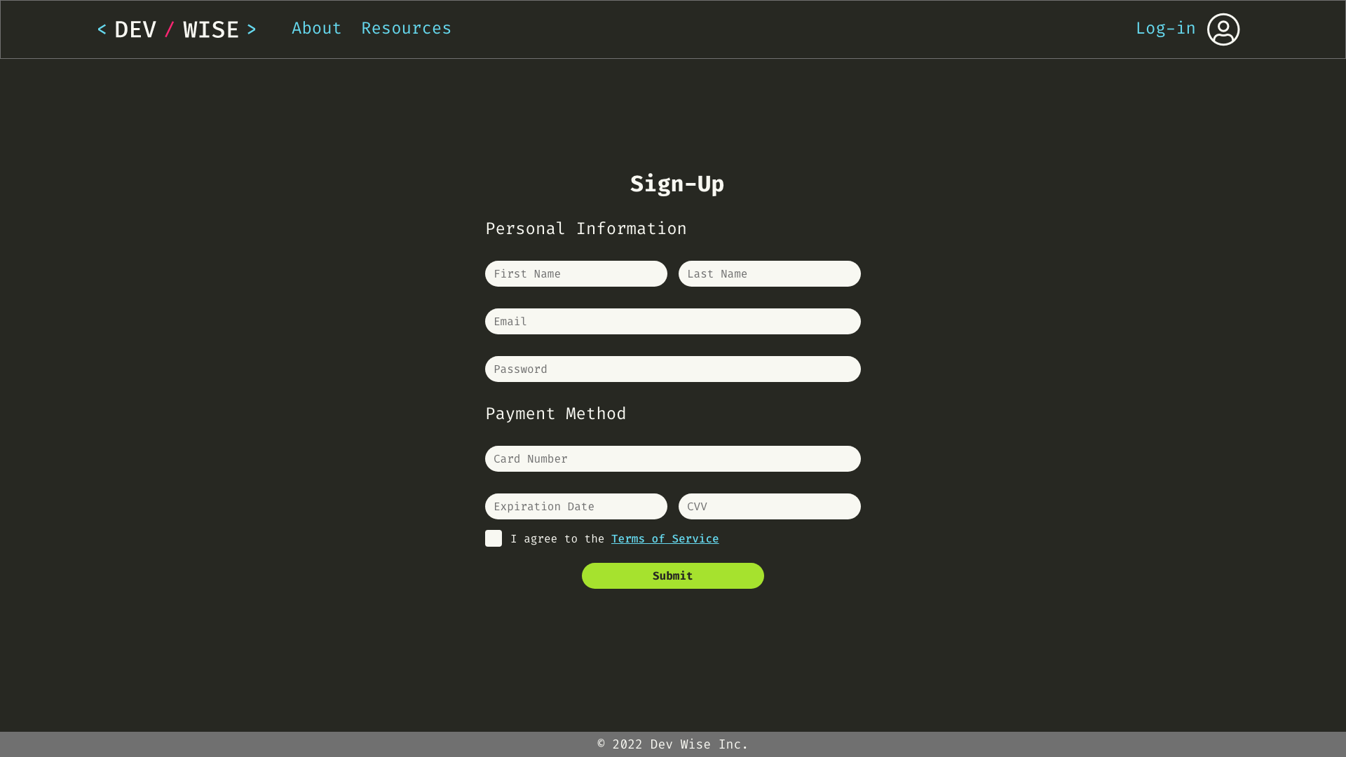
Screen size variations
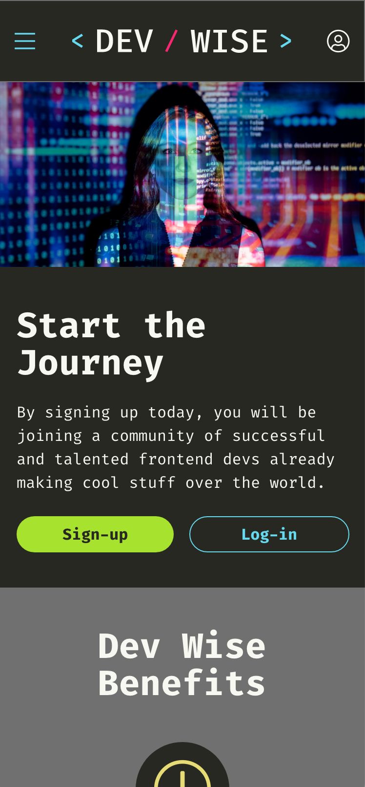
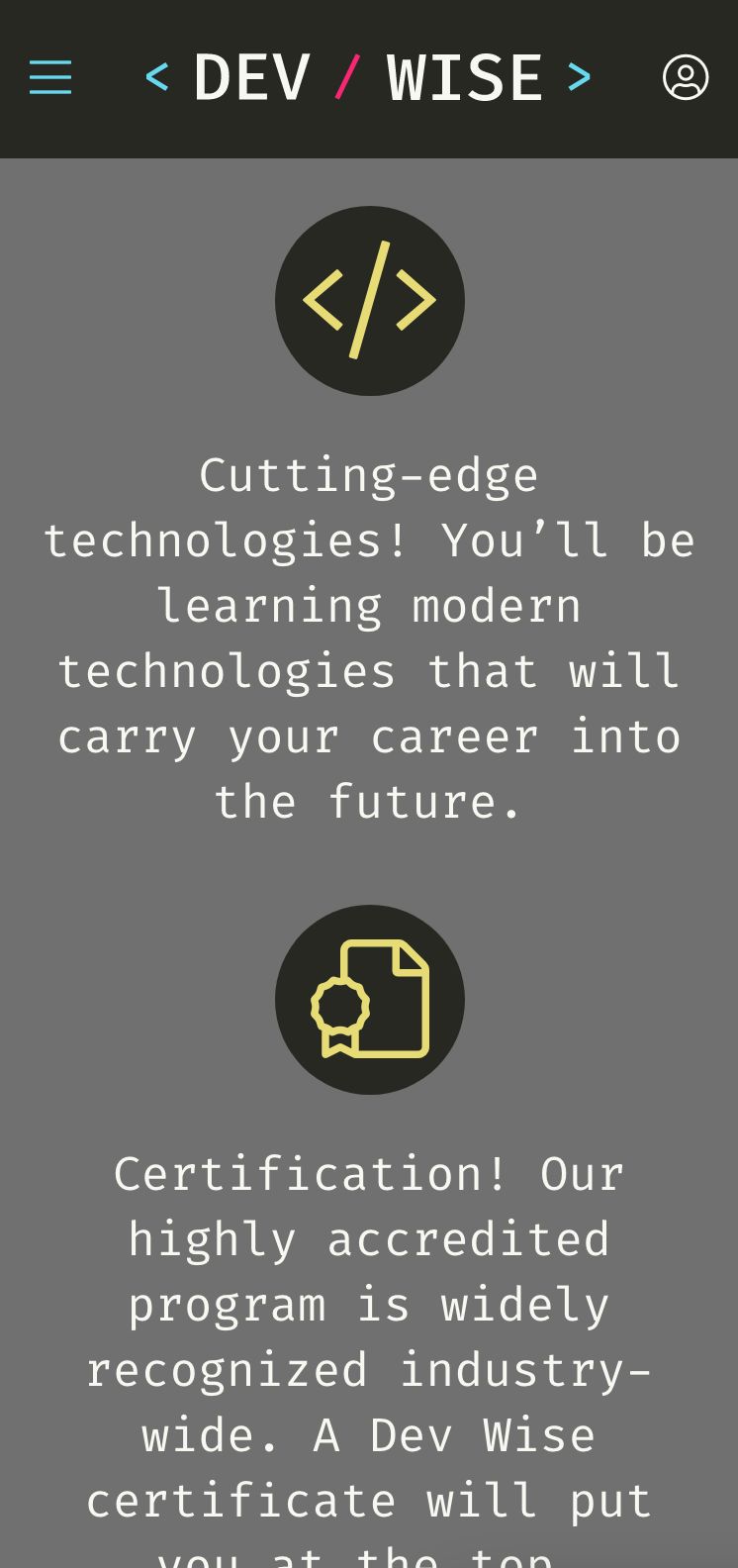
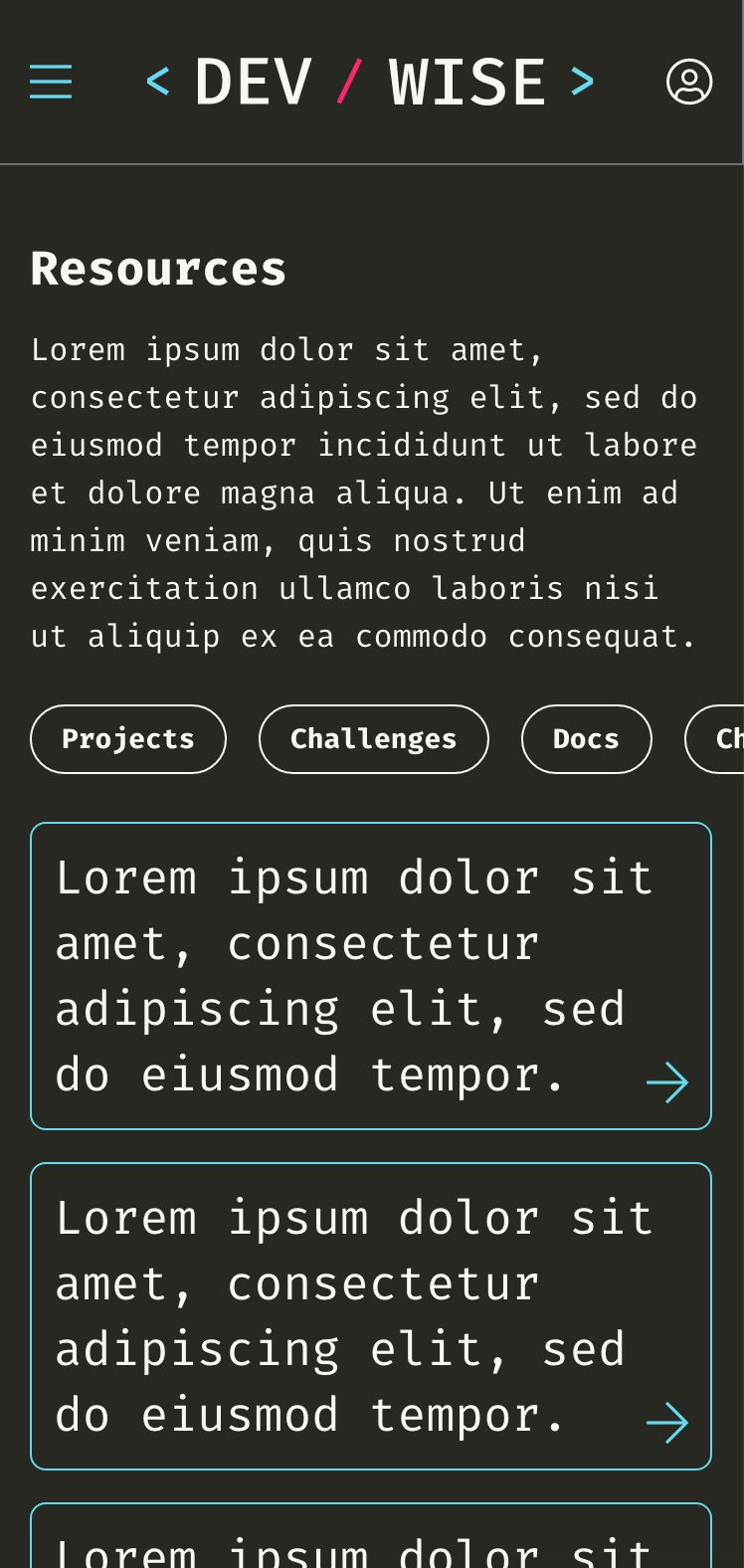
When designing for a responsive web, it's always important to consider the mobile view as well. Many use cases include students accessing their course from their smartphones.
High-fidelity prototype
Finally, a completed hi-fi prototype!
